How to handle blank visuals in Microsoft Power BI
Microsoft Power BI is a powerful data visualization tool, used to make coherent and structured visuals out of your company’s data. Apps Associates Data & Analytics practice specializes in using this tool to make our customers’ data work for them. We work collaboratively with our customers to create the best solution for their data visualization needs. Often, we work together to problem-solve and create new solutions that help our customers get valuable insights from their data.
In this post, we’ll discuss a recent use case in which a customer required a “No Data Available” label to appear for blank visuals. By default, Power BI does not provide this option as part of its functionality. Below, we’ll showcase your options for adding an alternate message if you face a similar scenario.
Problem:
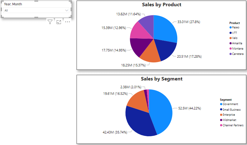
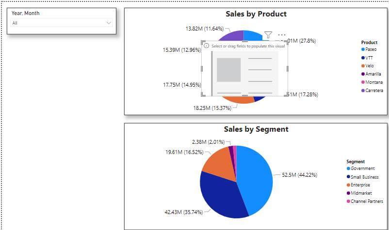
In Power BI, viewing data in a standard pie chart is a user-friendly way to display information at a glance. Users are well acquainted with these charts and can easily see the data represented. Here is an example with a Pie chart and a Slicer
However, no dataset is perfect. If there is no data available in a particular dataset, or for a specific time period based on your slicer choice, the chart will not display any information. This is true for any chart – column chart, bar chart, or pie chart.
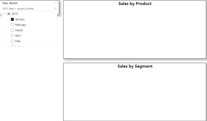
This can confuse your users, as they may not be aware if there is simply no data present, or if the visual is not loading. It is best practice to display a meaningful and useful message in this blank area to let the user know what they’re seeing – or not seeing.
Solution:
Let’s review how to create a message in Power BI to display when there is no data available.
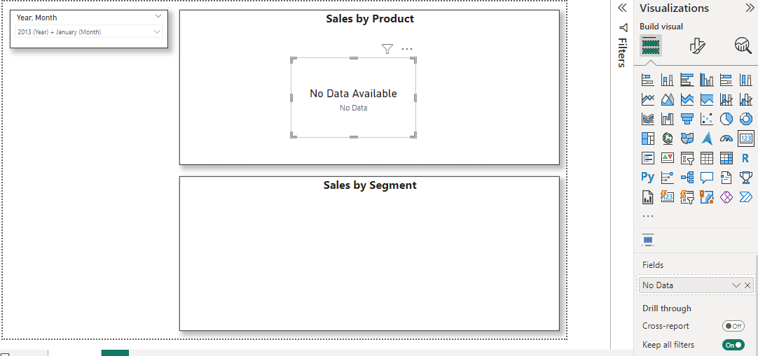
Step 1: Create a Measure for No data.
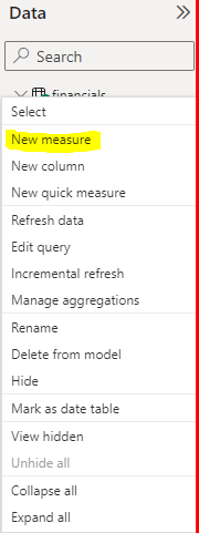
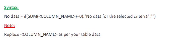
![]()
Step 2: Create a Card Visual
The next step in enhancing the pie chart is to add a card visual overlay on top of it. This card visual will display the value of the measure being represented by the chart.
Now add the No Data measure to the Card Visual.
As this specific card displays the error message, it would be advisable to change the font color to red. This will help draw attention to the error and make it more noticeable to the user.
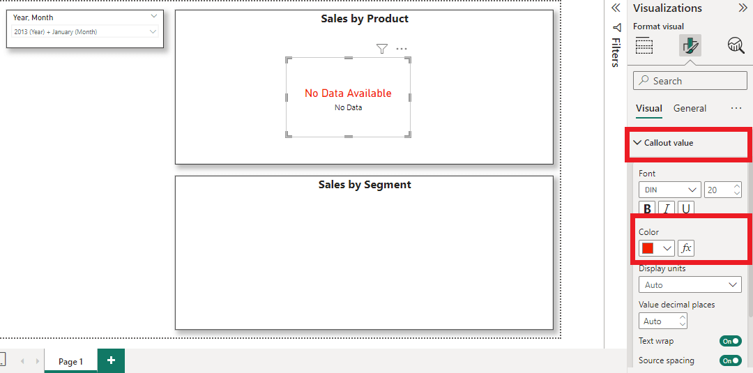
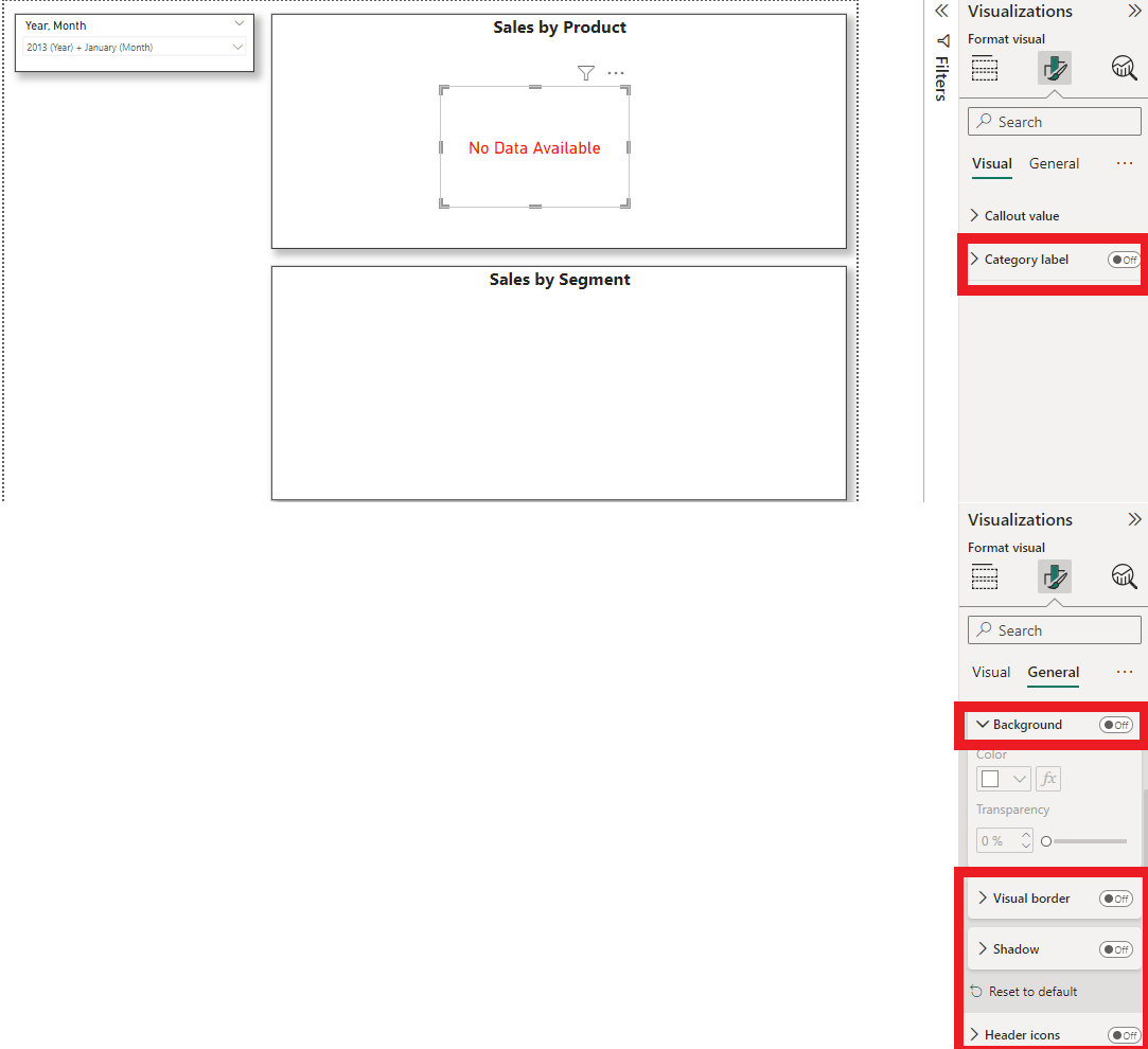
Step 3: Turn off most of the visual properties
Turn off unnecessary elements such as Category labels, animations, shadows, and gradients, and avoid excessive use of colors.
Step 4: Send Card Visual Backward
To send Card Visual backward, first click the Format tab, then click the Send Backward dropdown menu, and finally select Send Back. Or Expand Selection, drag the card visual to the bottom of the list.
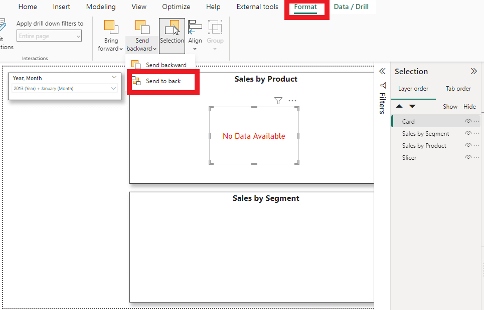
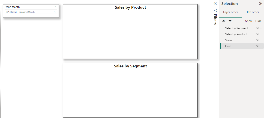
In the Selection pane, you can observe that the card visual has been moved to the bottom.
Step 5: Adjust the Transparency
To display the card visual located at the bottom, it is necessary to adjust the transparency of the pie chart visual to 100.
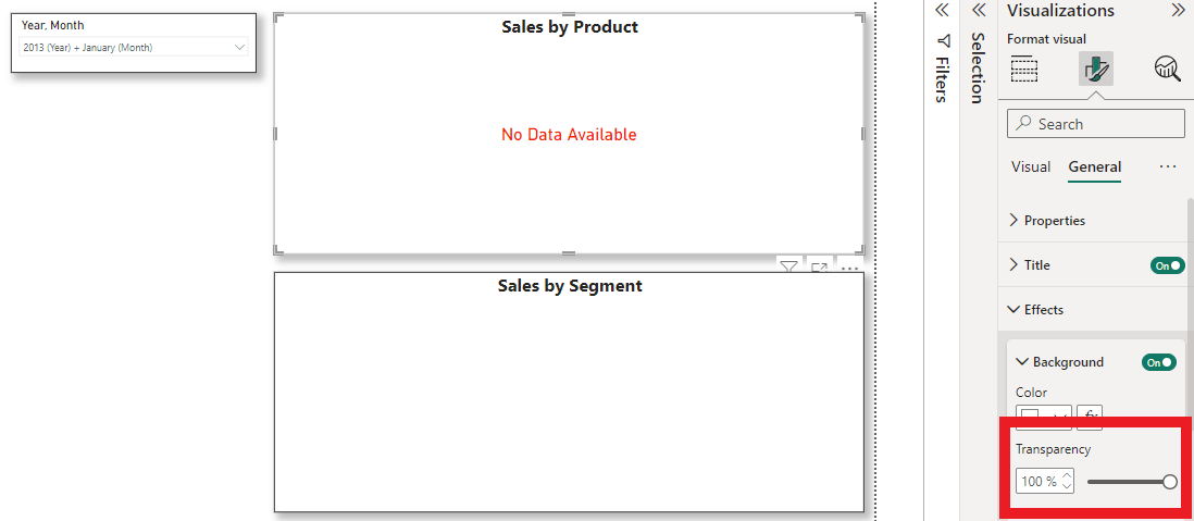
You may now select the slicer to observe the changes in your report.
Conclusion
In summary, Microsoft Power BI is a valuable tool to enhance the meaning behind your data. It allows for easily sharing datasets and information across departments, showcasing information in a way that most people can understand. With a few enhancements, such as the solution above to display a helpful message when there is no data available, your team can use Microsoft Power BI to its full potential.
Apps Associates helps customers craft and execute their data and analytics strategies. We believe that reporting and analytics are not an afterthought but at the center of your technology strategy. For more information about working with a partner like Apps Associates, reach out to us today.